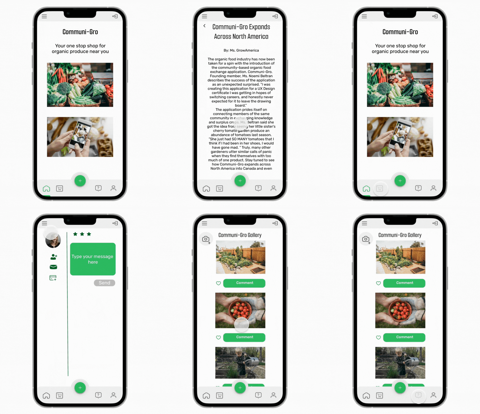
Communi-Gro
Communi-Gro
Communi-Gro is a mobile application that helps connect organic produce growers to consumers while providing a social platform for garden enthusiasts to connect.
-
Project Timeline
October 2021-February 2022
-
Role
UX Design & User Research
-
Tools Used
Photoshop, Balsamiq, Figma
Problem Statement
Fresh organic produce is only readily available in some urban areas. Gardeners who grow vegetables as a hobby often have a surplus of the same vegetables or herbs.
Solution
By creating an application specifically for people interested in buying, selling, or exchanging organic produce, consumers and buyers can skip large grocery stores and buy or trade goods directly with someone in the community.
Competitive Analysis
I first started researching what types of applications already existed that could solve my problem. I found a California-based application, FarmStand, and as I navigated the app, I found that it needed more information and only worked in certain states.
Key Takeaways:
This app could be improved by adding visual evidence of what the business offers.
An app tackling this problem should be inclusive and allow people all over the U.S. to participate.
Provide more information on the business page to earn customers’ trust.
Offer an opportunity for interaction between customers of similar products.
Qualitative research through in-person and virtual interviews with potential users
For this case study, I conducted in-person and over-the-phone interviews to understand the customers' demographics using my proposed application.
Key Takeaways from interviews:
People serious about gardening or have a garden that consistently produces some vegetables often have surplus goods they do not know what to do with.
People are looking for a safe way to communicate.
Users want interaction with people who share similar interests, not just to exchange goods but also to exchange knowledge and receive feedback about best practices.
Making sense of user insights through affinity mapping and developing a user persona.
Creating this affinity map helped me better understand what the customers wanted in this application and also helped me figure out what essential elements to include.
This also helped me determine the type of customer this application would cater to.
Ideation Stage: Turning research gathered into visuals
Initial Sketches:
Some of the problems I encountered included having too many icons on the bottom screen, trying to fit a photo gallery for users (similar to other social media apps such as Instagram), or creating a separate location for users who want to upload their photos.
Another thing I considered was how to condense all the things my users asked for in this application. I had to decide what the overall user would need to get the primary uses of this application.
I created a forum page where users can search through questions, answer questions, and post links to outside sources. This helps minimize the amount of information Communi-Gro would be responsible for and gives the users agency to contribute and collaborate, similar to Reddit.
Low fidelity Mockup:
I first created a low-fidelity mockup in Miro to figure out the general placement of the pages on my application.
High-Fidelity Mockup:
I created a high-fidelity mockup in Figma using the feedback I received from my low-fidelity Balsamiq mockup. I created one version, which I updated based on feedback from my last user interviews for the high-fidelity prototype.
Below are the application's main pages. I omitted the photo gallery from this visual once I conducted the first high-fidelity mockup user interviews and found that half of the users either took too long to navigate to the photo gallery or needed clarification about whether they would upload or view photos.
Usability Testing
During the usability testing, I found that most users easily and quickly navigated through the high-fidelity prototype. After one test, I edited the navigation bar's size and colors. I also changed some of the pages to fit my customers' needs better, such as simplifying the options for the photo section.
Reflection
I could still improve the application by having more interaction within the prototype. I also want to update the Forum page by researching best practices for this type of page. Overall, this design challenge was my first experience with a project's entire cycle using design thinking.
I look forward to future iterations of this project, as there is always room for growth and user feedback.
Click here for prototype.


